One of the biggest factors in web design in 2014 and beyond is making sure that your site is responsive. For those of you unaware of what this term means, here it is: Responsive web design makes sure that your site appears as clean and professional looking as possible across all types of hardware devices. From desktop computers to tablets and mobile devices, web users today can come from anywhere. With that in mind, you want to make sure your business is thinking about their experience across all devices.
As we put together this blog for Apex Digital Media we kept this in mind. Our site needs to look great on all devices but we also want to make sure that we’re running AdSense and learning in real time from our own implementation of the product. In installing the leaderboard ads (728×90) We noticed to our dismay that on mobile devices this ad format was not adjusting for the screen size. In fact, the 728×90 ad was forcing the page out and making our site look terrible and broken on iPhone and Android devices. We needed to consider responsive web design for Google AdSense.
To solve the problem, the first thing we tried was responsively resizing the ads via CSS based on the size of a users screen. This did not work, probably because due to best practices Google does not want this ad format resized for a mobile device because it subtracts value for their advertisers. With that in mind we really wanted to keep this format on desktop and tablet versions of the site because the implementation was clean and professional looking. So we were stuck at a crossroads…

We wanted the best of both worlds… a clean mobile experience but the ability to monetize the blog with the 728×90 leaderboard ad format. We decided it would be worthwhile to just remove this format altogether for the sake of our user experience. Sometimes when you want cake you have to compromise.
If you’re reading this post on a mobile device you can probably see that the 728×90 format is not there and the site template is clean and professional. It does still contain ads though. The 300×250 format tends to work well with mobile templates so we are still able to monetize mobile traffic while maintaining a user experience that is in line with our standards and with general best practices.
How did we do it you ask? This is one area where we’re happy to share our knowledge as it will make the mobile web a better place for all… (it’s also readily available to anyone with a black belt in Google-Fu).
Google Makes Responsive Web Design for Google AdSense Easy
To start, you need to generate a piece of AdSense code for your site. (If you don’t know how to do that yet you may want to start here.) Once you have your personalized AdSense code on your website you’ll want to surf over to this link – and scroll down to the header “Hiding an ad unit” and expand it. It will show you some sample code, copy and paste everything between the “style” tags.
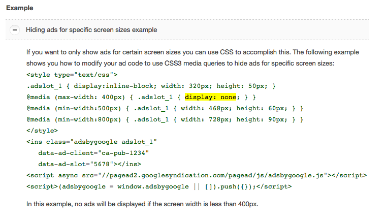
Next you will want to amend your AdSense code slightly by adding the class of the style inside the ins class: “adsbygoogle” so it looks like this “adsbygoogle adslot_1”.
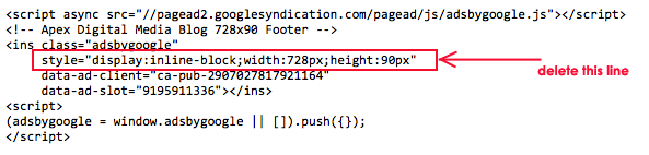
Finally – and this is the hangup we ran into, you MUST be sure to remove the style declaration in your personalized code. (refer to the screen shot below where it is circled in red).
Once you have set up the style, inserted the call and removed the original style declaration from your AdSense code you can save it and it should completely remove that ad slot from any devices with a screen width of less than 400 pixels. If you’re really advanced you can also tweak the code to make that width larger or smaller.
You’re welcome.
One thought on “Responsive Web Design for Google AdSense”